Signage is a key part of an orientation strategy, particularly for those living with dementia. Easy navigation around unfamiliar places such as hospitals contributes towards a reduction in falls, agitation, and incontinence.
Road signage is a perfect example of clever design, and the same principles should be followed when designing signs for people living with dementia – simple and consistent use of colours, shapes, sizes, fonts, images, the use of non-reflective materials and ideal positioning for optimum visibility.
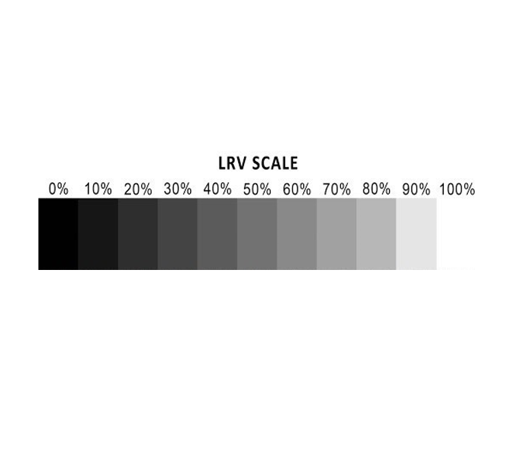
There is no such thing as a dementia-friendly colour. The focus should be on ensuring a good colour contrast. This can either be achieved by using shades of colours (i.e. light blue and dark blue), which is quite straight forward, or by combining colours using light reflectance values (LRVs) which is more complicated.
All colours are on the LRV scale (Low Reflectance Values) and for a person with sight impairment to successfully differentiate between two contrasting colours, there must be at least thirty points of difference. For example, a shade of red with an LRV of 40% would look the same as a shade of green with an LRV of 40%. A shade of red with an LRV of 30% with a shade of green with an LRV of 70% should provide a marked contrast.
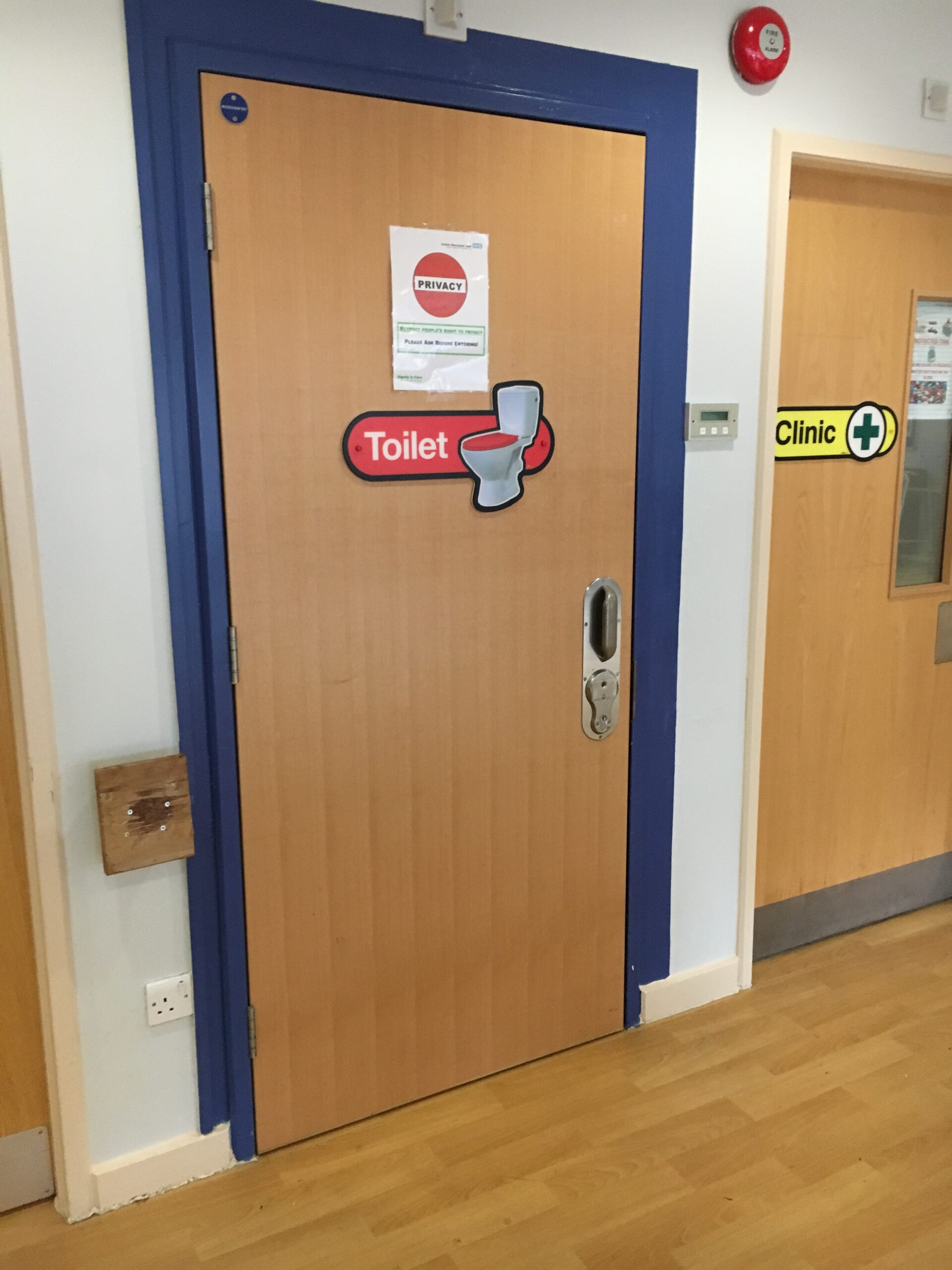
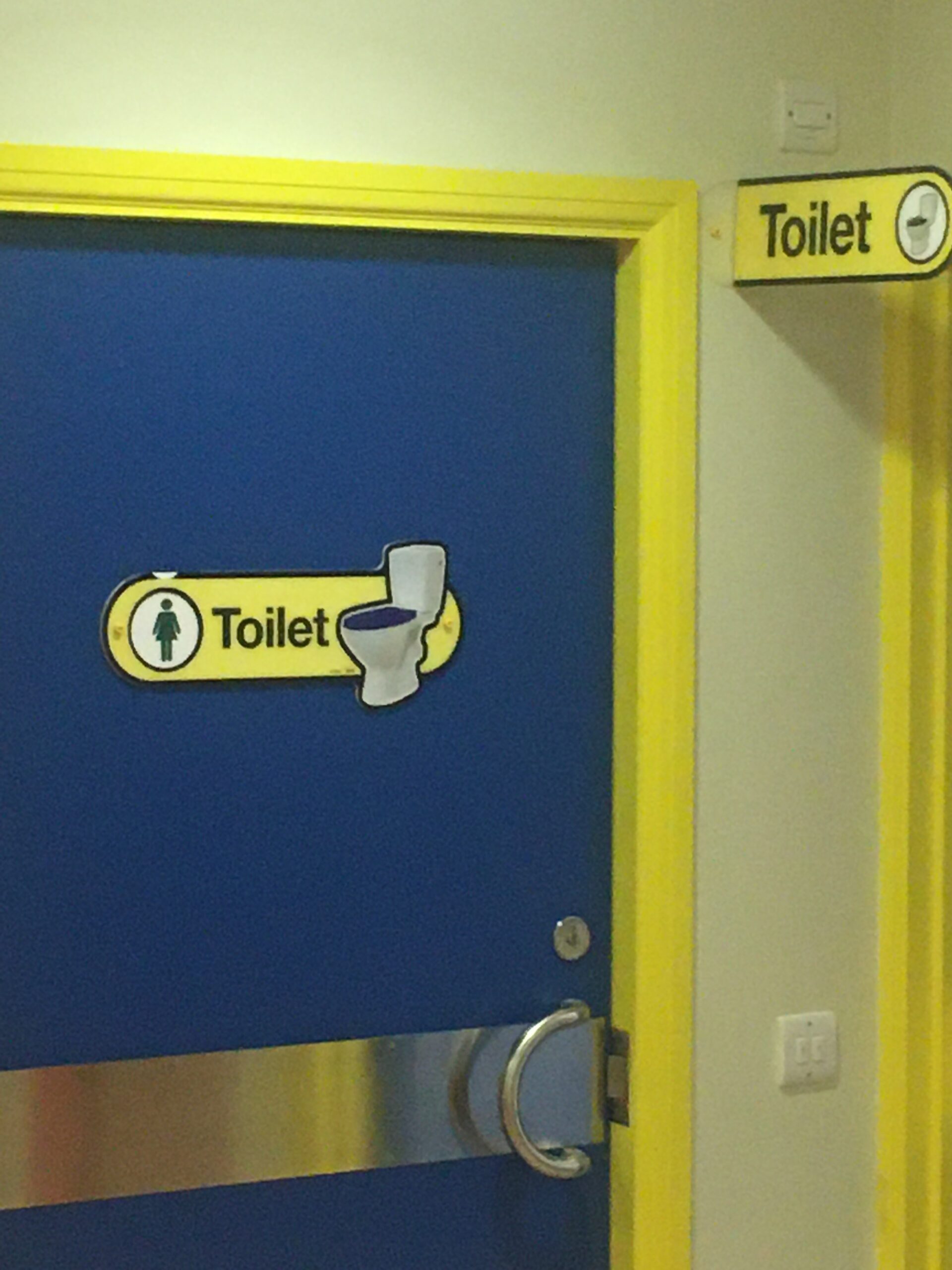
The only exception to the use of colour contrast is when deciding on the colour for toilet door signage. Unlike other destinations, finding the toilet is time critical and therefore use a bold colour that is easy see, such as yellow.
Shape can be another good clue in helping to identify a specific sign, which is particularly important for ones such as the Toilet.
We learn to read and write using upper- and lower-case letters and scan rather than read every word. The correct use of fonts is therefore essential for easy reading.
Dementia affects people in different ways and at different times along their pathway. The use of images is very useful for people who lose their ability to read, where English is a second language and for some with learning disabilities.
Dementia-friendly signs should have a non-reflective surface to ensure easy to read
The ideal height for a sign is 1.2m-1.4m above the ground. As we age, we can lose up to six” inches in height and look downward towards the floor more. People in wheelchairs also benefit by signage at the correct height
For further information or help please Contact Us